Does messy or clean bring you calmness or freedom? (Part 1)
Messy desk? Clean desk? What kind of a workspace suits you?
Or if you are an artist:
Messy palette? Or clean palette?
The cleanliness or messiness of our desks or office often says something overall about how people deal with stress and reduce tension.
My students frequnetly ask me about their palettes and how often they should clean them. If they should wipe off all the paint? (No.) If the palette needs to be covered? (No.) If you need to use distilled water in your palette? (Not unless you have very mineral-rich well water, or other questionable water.)
In this post, we’ll be talking about artists' palettes, but I think this discussion applies to a variety of work spaces too. Your home office, your hobby space, your garden?
Messy watercolor palette? Or, pristine?
As a watercolor artist, I’m asked if it is important to keep a watercolor palette impeccably clean, or if it’s more important to paint with abandon, and let the palette turn into a sloppy mess?
The answer has nuances. We’ll cover these differences in this two-part post.
Your palette carries the signature of your creative process. It conveys your artistic choices.

This was my set-up for painting peonies. I had three palettes that day. I had a separate palette for reds and a separate palette for blues. Those two were in addition to my "primary" palette, the small one to the lower right. This palette has three fold-out areas for mixing paint. The "cross-contamination-of-color" in the wells in the small palette is fairly typical of a work-in-progress for me. I start with it clean and, as I paint, I don't worry much about one paint getting in another.
For example, we see from the paint selection pictured above: How many and which paints are included; where the paint is placed on the palette (this speaks to the use of a color scheme); and even how aggressively a brush grabs the paint (shown by the impressions of brushes in the paint wells).
The organization and tidiness, along with the visual and emotional feedback you get from your palette are surprisingly important in shaping your painting enjoyment.
No Right or Wrong: What Works for You?

I grabbed a screenshot of this watercolor palette in a video a few years ago. This artist's paintings were dazzling in their clarity and freshness. I was surprised when I saw his palette because it seemed so dirty. The hues were almost indecipherable. Yet, he created sparkling ocean waves with this palette.
Watercolor painting is a dance among you and your materials—each element and tool has a part in the dance. One of the pleasures of watercolor is watching all the contributing elements present their own personalities. Your magic may look different than mine :-)
Three Artists and Their Palettes
The following three artists are friends of mine, and they each use different palettes, have different processes, and of course, create different outcomes. They all produce remarkable work.
Carol Carter
"I like both a clean palette tray, but messy and moist wells of color. I use 3 palettes."
Carol Carter, teaches, travels, and sells her work. Her studio is in St. Louis, Missouri.

Carol's palette. Her palette is not in "color wheel" order. That's a decision of personal preference.
Carol has mastered, more than any other artist I am aware of, the “backflow” or “bloom" in her work. These words describe the effect when watery-paint is added to an area that is partially dry. One achieves a lace-y, cauliflower shape, with a hard-edge at the perimeter of a wash. This is a tricky, sophisticated technique.

Carol Carter, contact her if interested in her work or workshops. Notice the edges of the light purple on the arms of her son. It has a look like water advancing on a beach. That is a "backflow."
Carol includes this technique strategically in her work. It requires an in-depth familiarity with how the paint is going to react with all its neighbors in the palette. A clean palette is essential for this.
Marilynne Bradley
Marilynne’s opinion about a palette is: “If it's too clean you are afraid to take chances.”
Marilynne Bradley, teaches, travels, and sells her work. Her studio is in Webster Groves, MO.

Marilynne configures overlapping narrow palettes on her work surface. She does not us as much mixing space in a palette as Carol or I do. Marilynne also does not arrange her palette in color wheel order.
She paints instinctively, rather than with a precise dedication to reality. We can feel the spontaneity in her work. She often uses splattering and gestural strokes to increase the color and zippiness to her work.

If she were constrained by methodically and slowly selecting her paint, it would upset the flow in her artistic process. Her brush plunges in, wiggles around in the paint, and jumps to her painting.
Stephen Quiller
“I always start with a clean palette. As I mix more neutral colors I do not clean the palette. However any time I introduce a new color or color mix, I always clean my palette.”
Stephen Quiller, teaches, travels, and sells her work. His studio is in Crede, CO.

The Quiller Palette. This is how Stephen has sets up his palette. He created this palette design. If you are interested in his palette, his artwork or his workshops, please contact him directly.
He designed this palette, The Quiller Palette, in a circular form. It re-creates the familiar form of the color wheel. It arranges complimentary colors directly opposite each other, and makes it easy to see the primary, secondary, and tertiary colors.
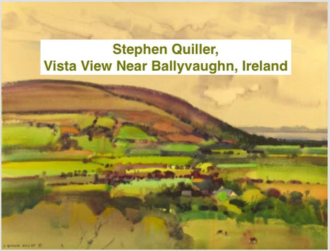
Stephen Quiller from a painting trip to Ireland.
Stephen is very precise in the hues he selects for his palette and his fastidiousness on the cleanliness of his palette. He has published books on color theory and the use of color in water-media. Color is key to his creation of his work.
Concluding Thoughts (before the follow-up post!)
It's important to find the right palette, or the right workspace, to help in your process.
"In the end, messy or organized, it comes down to what makes people most productive."
And, I would add, to find what makes you feel most embraced in your workspace.
In my next post, I’ll share the differences between a watercolor palette and an oil palette (who knew they were different?), my palette choices, palettes from civilizations thousands of years ago—and yes, they used watercolor paints very similar to ours today!
Did you like this information? All of my blog posts start as an e-letter and my next e-letter is due out soon. Don't miss out!


Send a message or leave a comment