When Light is the Hero in Our Art
Light is literally a visual indicator of energy. It can serve as the focal point and the hero in our art. Or, not. And, as usual, as the artist, you get to define its role.
WHAT IS THE IMPORTANCE OF LIGHT?
Light is always an element in visual art, whether it is recognized and highlighted or not. Without the cues of light, such as shadows, reflections, highlights, indicators of shape and mass, and even value or color, we wouldn’t be able to see anything. (I’m speaking as an artist here, not as a scientist.)
In layperson’s terms, for us to see art, we must have light, both around us and there must be some sense of light within the art.
Mark Rothko’s "black" paintings are as close to an absence of light in a painting as I can think of.
Mark Rothko's Untitled, (Black Blue Painting) sold at Phillips Auction to an unnamed West Coast Collector. It sold for £2,866,000. It was on loan to the MOCO Museum of Amsterdam through 2020.
I hasten to add that it is impossible to effectively show Rothko’s black paintings online. Some of his paintings are black as well as other dark colors. The one above is named "Black Blue."
With Rothko's "black" paintings, as you stand in front of them you may see subtle variations in the surface. These surface deviations reveal a distortion of light on the surface. Rothko's intentionality with the manipulation of the surface creates a conversation with the viewer. I love Rothko’s paintings and I regret that I don't know how to do them justice via a still image online.
“The people who weep before my pictures are having the same religious experience I had when I painted them.” - Mark Rothko
THE ARTIST’S ROLE IN PORTRAYING LIGHT
The artist always has a choice to make about light. Whether he or she is cognizant and deliberately defines a role for light in the painting, or whether the artist defaults to an unconsidered portrayal, the personality of the light is on a continuum from being a compositional hero or a background player.
There are a million ways to discuss light in art. Here, we are going to take a quick dive into a couple of my favorite uses of light:
- Backlighting
- Chiaroscuro
LIGHT FROM THE BACK: BACKLIGHTING
Backlighting is when the light source is behind the subject. It often creates a glow around a focal point of the painting. There may be a silhouette effect, with a dark-colored outline against a lighter background.
American painter Albert Bierstadt (1830-1902) often used backlighting for his majestic scenes of the Western US.

Albert Bierstadt, "Among the Sierra Nevada, California" From the collection of the Smithsonian Museum of American Art, Washington, DC.
Painted in 1868, oil on canvas, this painting is in the Smithsonian Museum of American Art, Washington, DC.

"Rocky Mountain Landscape," by Bierstadt, 1870, is in the collection of the White House. Photo credit by: LQHnphqTI0chUg at Google Cultural Institute. Public domain.
In each of these Bierstadt paintings, the light is from the back, but also from above, giving the scenes a divine, ethereal aura.
A simple watercolor painting of mine also conveys the backlit sense of the sun behind the trees.

Jane M. Mason, watercolor painting. (c) "Sun Behind the Trees."
Owned by a private collector.
The background is a blur of yellows and greens suggesting foliage with the sun behind it. The edges of the forward trees are dark with long shadows suggesting the light behind them.
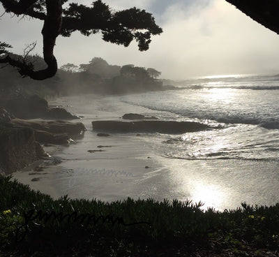
Here is one of my photographs from the area around the Big Sur in California. The fog was rising, beginning to expose the brilliant rays of sun. This photo is in color. But the contrast between the sun and the bright reflections on the beach were overpowering the capabilities of the camera to capture the range of values and colors. At this point, we can see a bit blue in the sky, but the rest of the color is blown out.

Jane M. Mason, Photograph, Big Sur Reflections (c)
The vegetation on the bank in the foreground creates a distinctive silhouette-edge with its pointed leaves.
For essays on silhouettes, see "Matisse’s Cut Outs," and, "Silhouette History"

Jane at a former Michael Symon restaurant in Cleveland on 4th Street.
Photo credit: John Pysarchuk.
This is a snapshot of me at a Michael Symon restaurant in Cleveland several years ago. This is an image with backlighting from several individual sources. Notice how the flare from the lights distorts the edges within the areas I’ve circled; the servers are distorted at the bright edge of the light, and the light in the top-middle has distorted the elements of the building.
Distortion, where the extremely bright light is behind an object, is another effect of backlighting.

Moses Davis, III, T3am Productions, a broadcast and media company in LA.
From their Facebook page.
This magnificent image is of the Griffith Observatory in LA. It captures that illusive green spark that happens just at the instant the sun sets below the horizon. It's also an example of how the intense light distorts the shape of an object. Moses Davis III is a part of this production company and a good friend of mine. Hats off to him and his team for this stunning photo.
CHIAROSCURO
This is an Italian word without a literal translation. In a clunky way, it would be translated as “clear-dark,” or more logically, “light-dark.” In Italian, it’s pronounced pretty much as it looks, although the “ch” has a hard “k” sound like “key.” So, it would be pronounced as: “Ke-ar-o-scuro.”
The concept means using dark areas against, or next to, light areas, for emphasis. The stronger the contrast, the stronger the effect. The term was coined in the Renaissance. A similar French term, “clair-obscur” was introduced into the art world at approximately the same time.
But the Italian word is the word used in English and Italian today.
In considering chiaroscuro, I realized recently that the term infrequently includes art that is backlit. Most examples and definitions of chiaroscuro refer to side-lighting, such as "Judith and her Maid Servant and the Head of Holofernes." 1623-1625, by Artemisia Gentileschi.

Artemisia Gentileschi, from the collection of the Detroit Institute of Art.
The dramatic "theatrical" lighting from the side, presumably by candlelight, adds to the foreboding of the scene. Artemisia and Caravaggio overlapped in much of their careers although he was about 20 years older than she. At that time, that was about a generation apart. Many people compare, and even confuse, their styles due to their use of chiaroscuro and the intensity of the scenes they each painted.
In addition to the work of Artemisia and Caravaggio, the technique surged into masterful use by Vermeer, Leonardo da Vinci, and Rembrandt.
This drawing, “Head of a Woman (La Scapigliata)” by da Vinci is a three-quarters profile of a young woman. The chiaroscuro effect is from the brightness of the surfaces of her forehead and the tops of her cheeks. The darker areas fall under her chin and at the side of her face. This painting was done on poplar. So I am assuming the “banding” in the surface is created by elements in the poplar.

Head of a Woman (La Scapigliata) 1500-1505. From the collection of The Met.
This unfinished portrayal of a young woman with disheveled hair (hence its nickname, scapigliata) is principally a brush drawing with some pigment, its treatment similar to other incomplete works by the artist. - From the online text about the image. - The Met
In Rembrandt’s "Night Watch" the chiaroscuro effect is generated by lighting that is partially from the side and primarily overhead.

Rembrandt, 1642. "The Night Watch." In the collection of the Amsterdam Museum on permanent loan to Rijksmuseum in Amsterdam, Netherlands
"The Night Watch" was completed in 1642 at the peak of the Dutch Golden Age. It is a large painting, greater than 12’ by 14’.
In all of these paintings, the artists have assiduously determined that the light is actually coming from where ever he or she wants it to. And, its power or cast effect is also of the artist's choice. It doesn't have to be "real." Paintings, such as the one by Artemisia often stretch credulity in terms of a scene actually lit by one candle.
We think of these paintings as "super-realistic." But we see that the artists frequently manipulate or just invent the light and the light sources, to illuminate the scene as they want to paint it.
WHAT DO ALL THESE LIGHT SOURCES HAVE IN COMMON?
In all of these paintings, the light is a primary component in the composition. If the light were non-existent, or in the same value as everything else, the painting would “read” completely differently.
I sometimes forget to emphasize to my students (or even to myself) how important it is to consider not only the direction of the source of light, but to decide how big a role the light itself will play as part of the composition and the overall story being told.
Let me know if after reading this essay, you'll pay a bit more attention to the light in artwork.

A narrow snippet from a painting I did of the effect of sun on a beach. This is called "Best Friends." (c)
Did you like this information? All of my blog posts start as an e-letter and my next e-letter is due out soon. Don't miss out!


Send a message or leave a comment